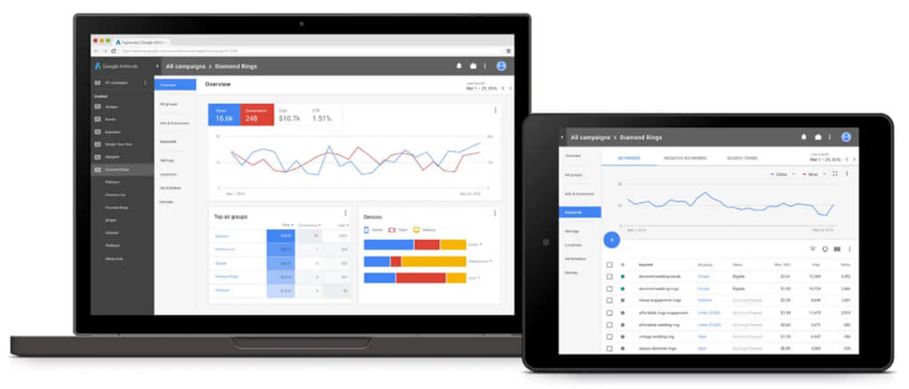
When computers and internet technology was relatively new who would have thought that over a period of time keywords will become an important part of the process. Google Adwords is Google’s advertising platform where Google makes money from the search as advertisers bid for on relevant keywords. Recently, Google has made changes to all their products in terms of design makeover and UI that would allow bidders to manage and bid conveniently.
The new UX is in sync with the Material Design that offers a consistent experience to the users whether they are using Google Adwords on the Web or through mobile. While Google claims that they’re only previewing the new UI for Adwords there are certain benefits and features that will soon become a part of it for next 15 years keeping the core functionality as it used to be.
Refreshed UX
When Google first came up with the concept of Google Adwords the overall UI was designed keeping in mind the regular Web users. However, in the last few years, there has been a tremendous shift in trends and more users are now searching the web and using Adwords through their smartphone. The new design makeover is more mobile-centric and makes it convenient and easier for the users to use various features and tools on their smartphones and mobile devices. Google is also trying to introduce some consistency in terms of user experience.
It is said that large retailers often spend up to $50 million per year on Adwords paid search and therefore Google is keen on introducing sophisticated technology and UI that offer comfort and convenience. The new Material Design update has the same design language like Google’s other products like Gmail, Maps, and Search.
Same Functionality & Framework
While the market for Adwords has changed considerably, Google is still keeping the core functionality and general framework for web users. As per the Google, the new design is a way to clean up and optimize Adwords for greater complexity. Hence, the elements found on Google Adwords will be familiar, but will get a new UI for an optimized experience. These visual changes will allow users to update text on a large amount of advertisements in a single click or track down individual interactions speedily and provide better UX factor. The only major difference with the new design is the way the data will be displayed.
New Features
The new design update is not about more features instead it’s a revamp of the old web based features in a new layout. However, there are few new features like deeper tracking and bulk edits that will make things easier for the users even when they handle these features through their mobile devices. This is basically changing the way the data is shown on the screen and how web users can make use of the data available to their business advantage.
Conclusion
The underlying reason for this new design shift is because Google wants to make Adwords easier to use and navigate. Adwords today is 15 years old and the overall design and UX factor seems to be aging. Google is introducing the Material Design UI to all its products because it improves user engagement, offers responsive and meaningful interactions through better UI/UX and it is cost effective because the same prototype design can be used on multiple platforms.

